PURELY
"A brand built on the obsession of 100% fruit purity and dynamic typography."
Visual Identity System / 2026
Purely is a self-initiated project exploring how typography can dictate the energy of a product. The choice of a fluid yet structured typeface reflects the organic nature of the juice while maintaining a modern, shelf-ready presence. Purely is more than a juice; it's a typographic experiment. The chosen typeface flows like the liquid it represents, yet maintains a structure that screams premium quality. 100% Fruit. 100% Design.
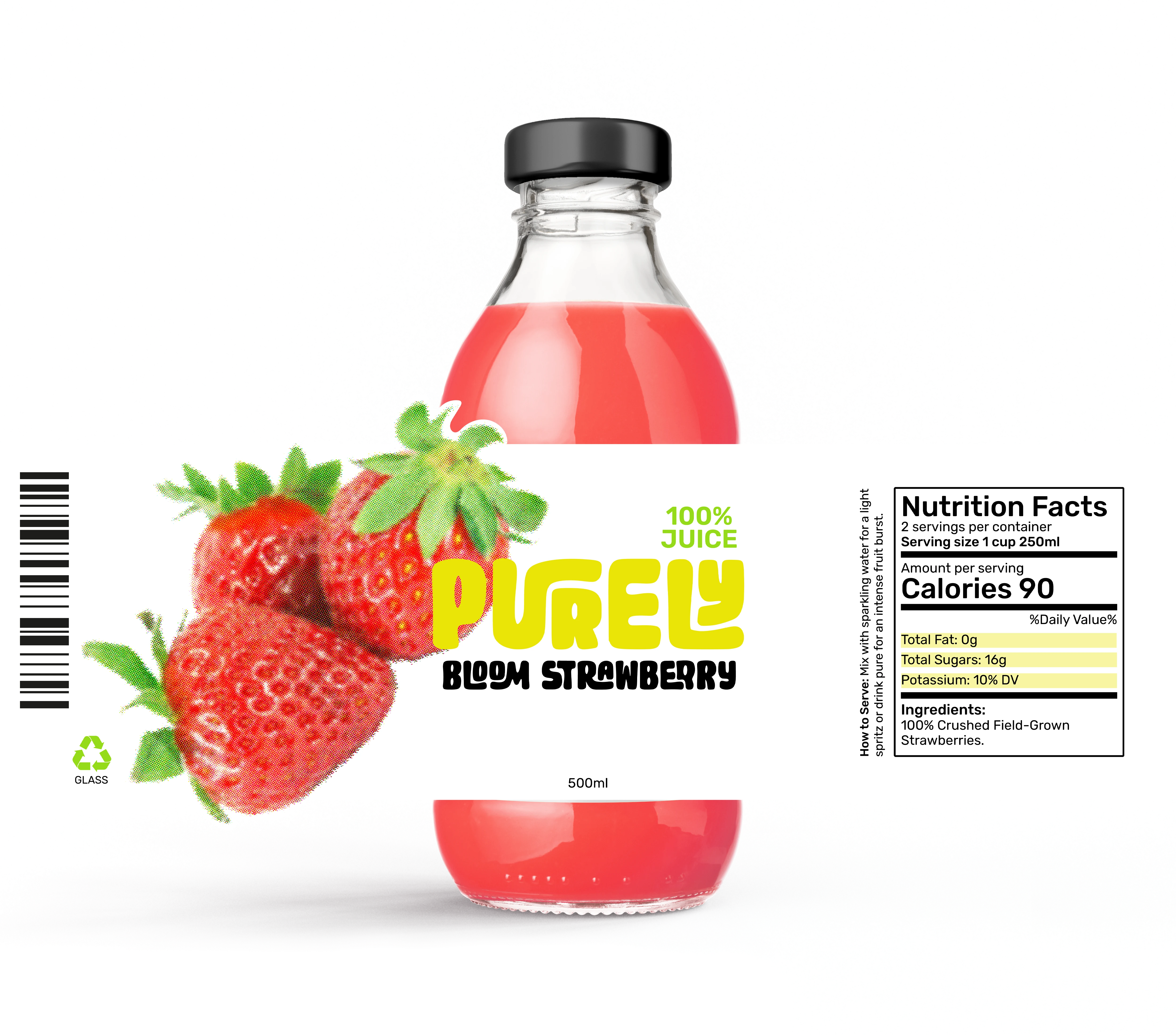
Strawberry
✦I wanted this to feel like a punch of pure fruit. No filters, no additives, just that raw red energy hitting you at once. It’s the baseline of the whole brand.
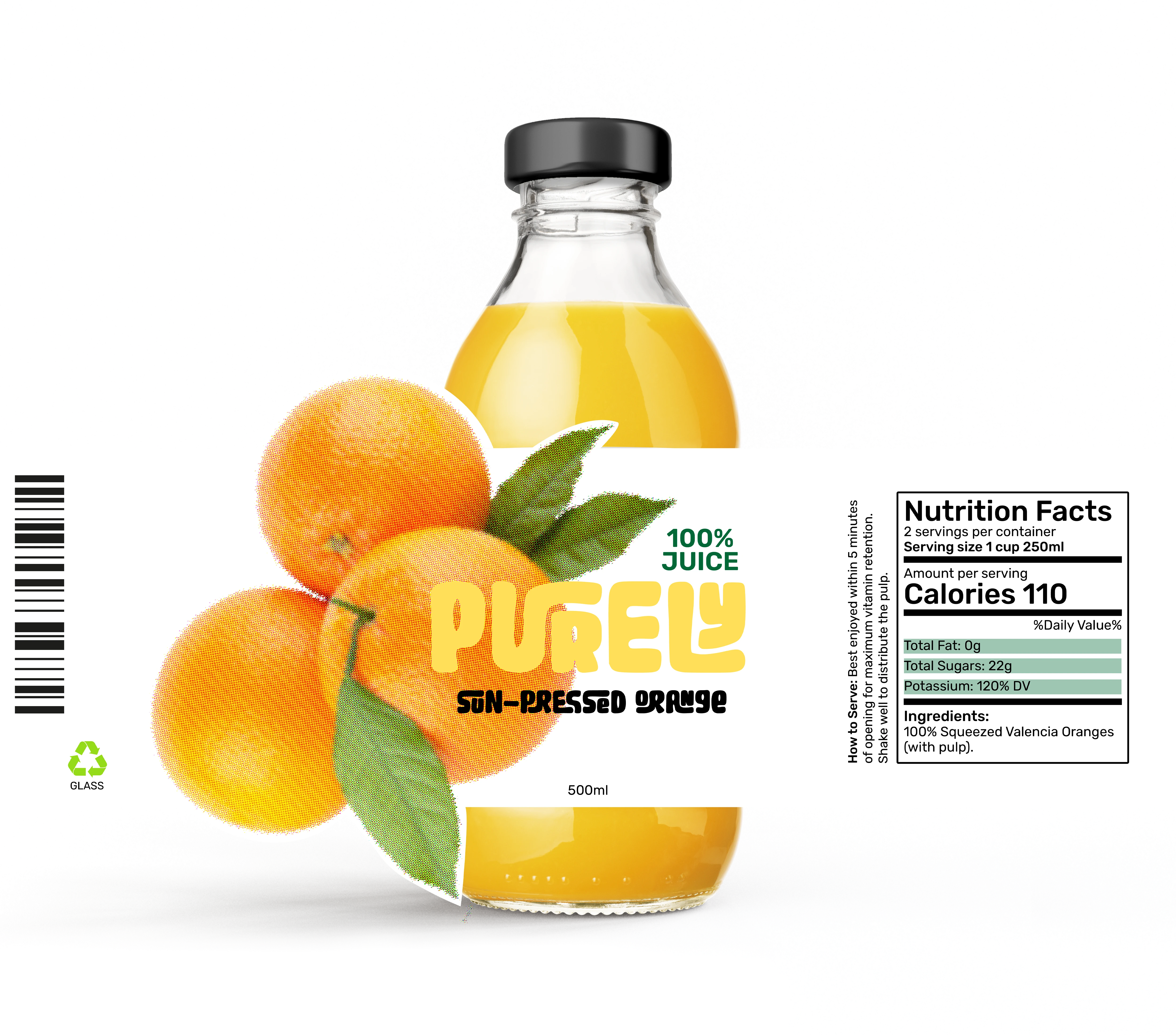
Orange
✦This is the ultimate wake-up call. I was looking for that sharp, acidic vibration you get from a real orange.
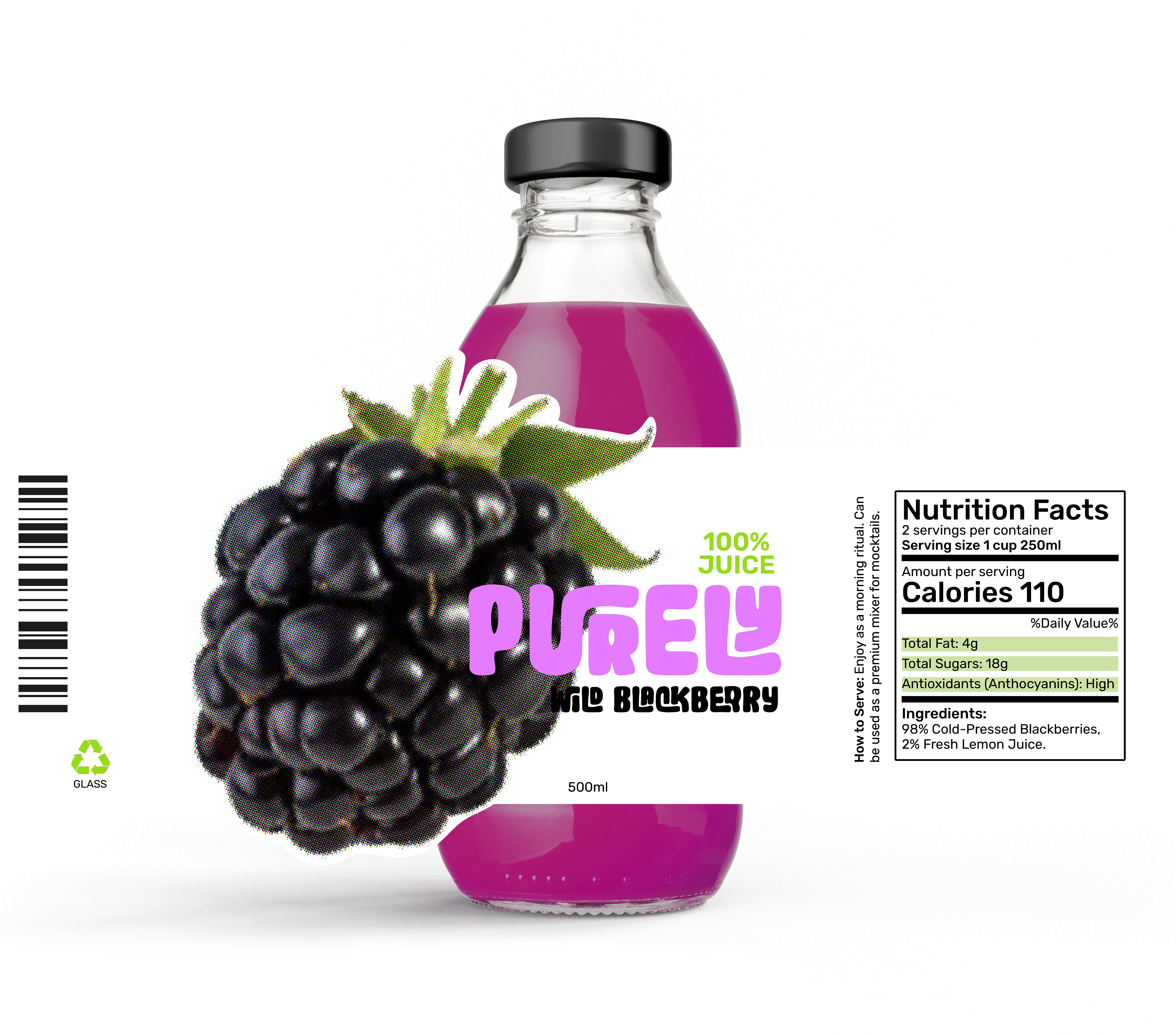
Blackberry
✦Sophistication in a bottle. The deeper tones allowed for a more elegant approach to the PURELY identity system.
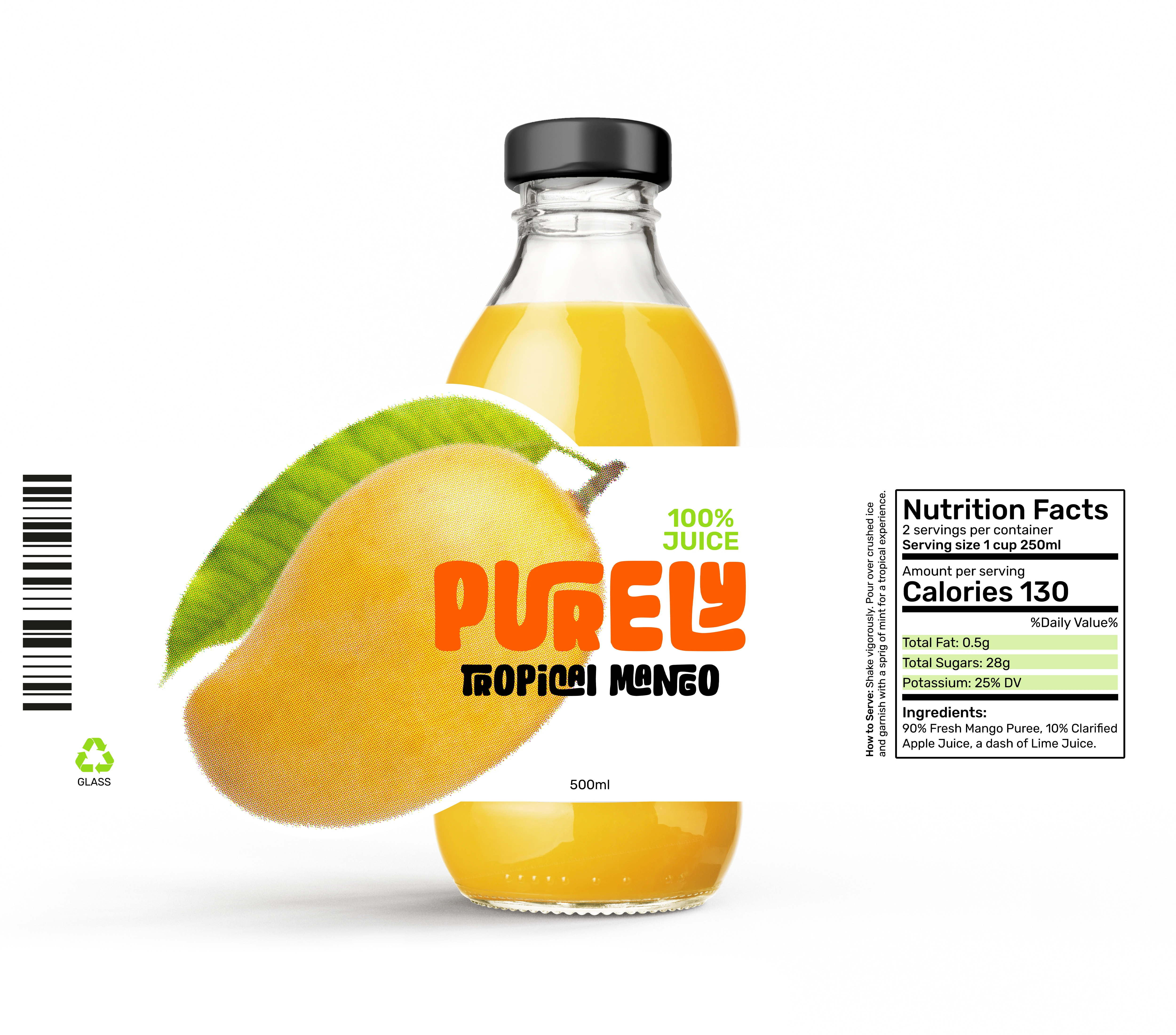
Mango
✦This one is all about density. When you think of mango, you think of that thick, solar texture. I wanted the bottle to feel heavy just by looking at it.
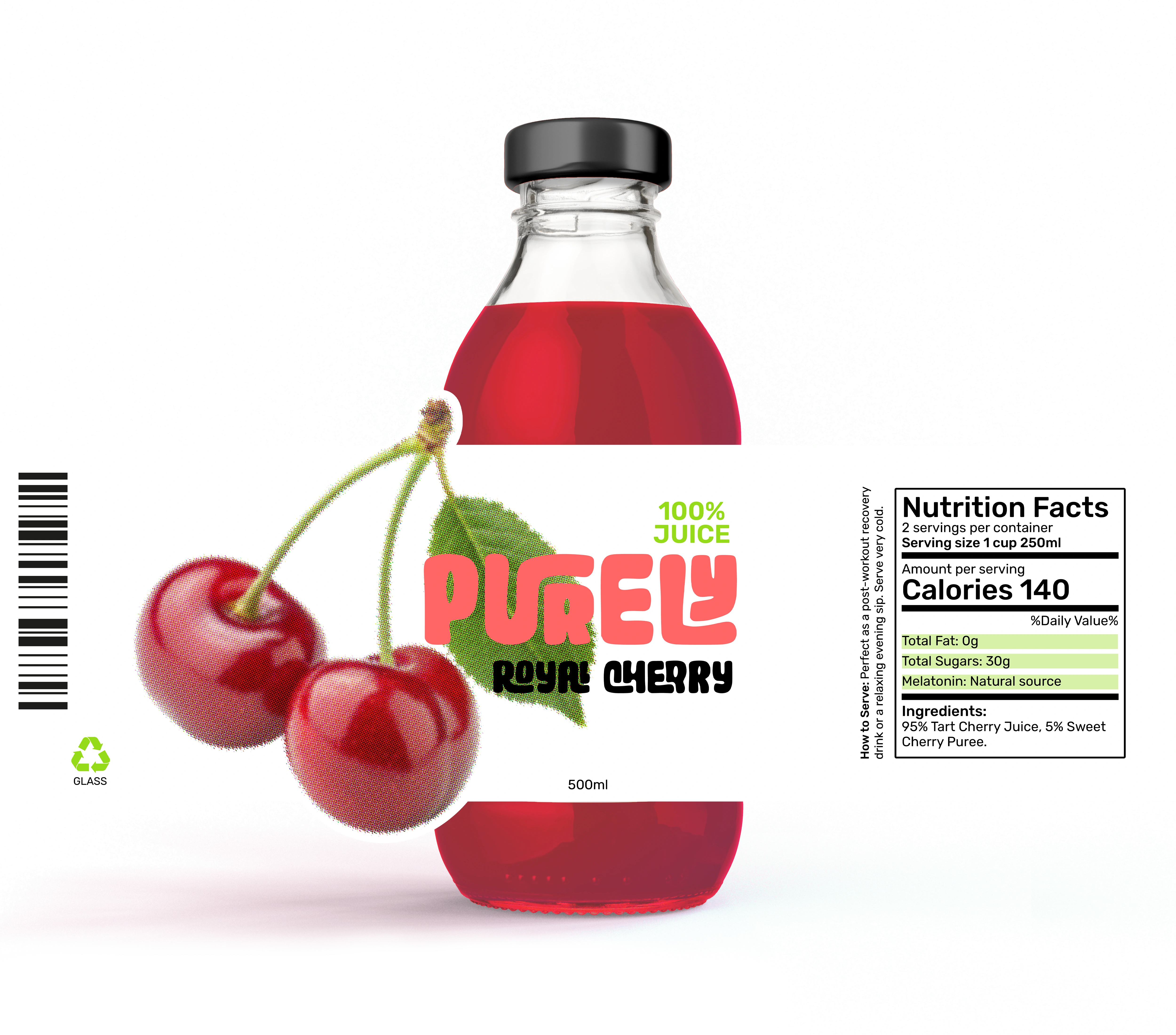
Cherry
✦Intensity and sweetness. I wanted to play with irony here. Cherries are small, but the attitude of this juice is massive. I ditched the "sweet and cute" vibe for something much more aggressive.
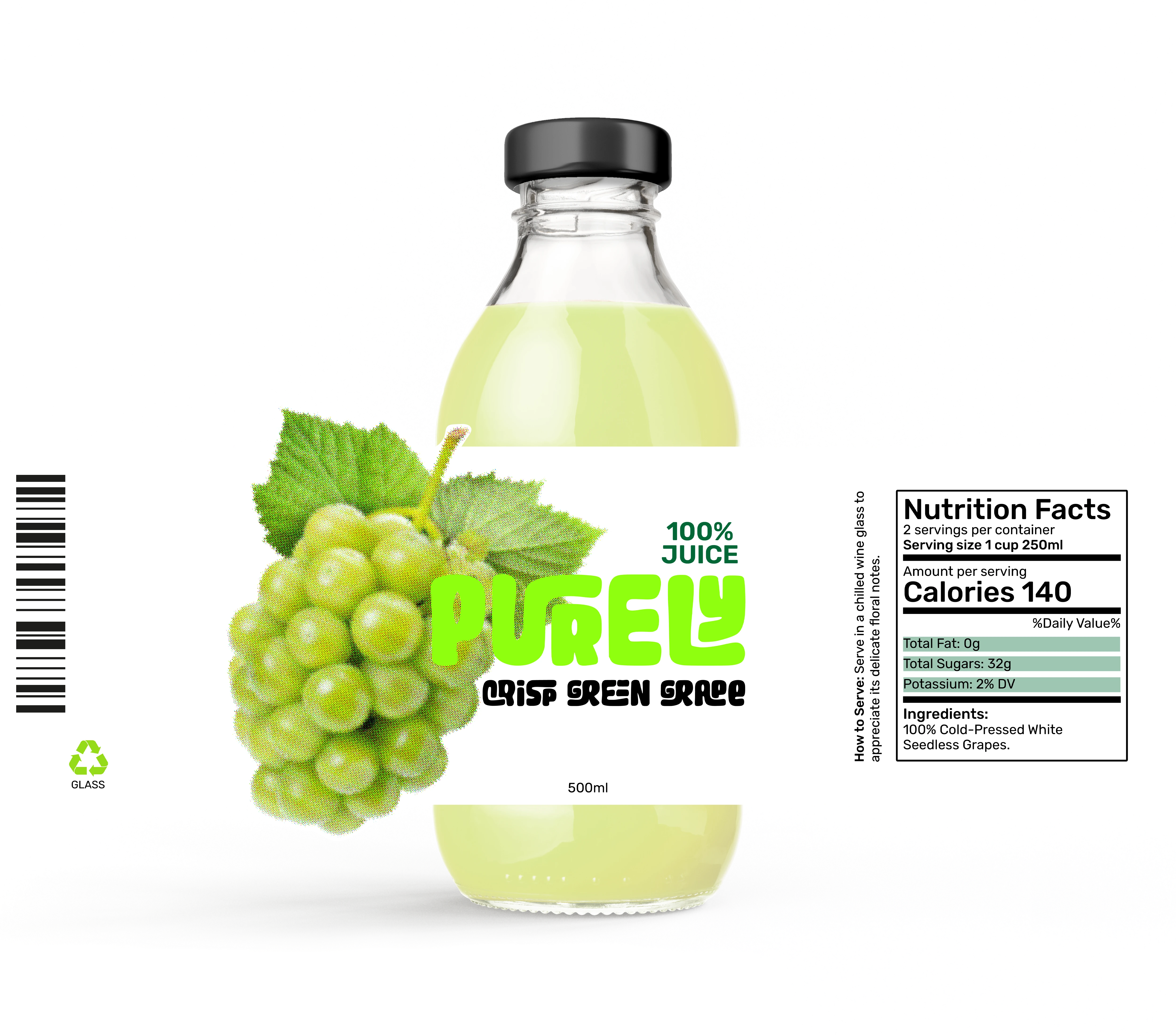
green Grape
✦I’m tired of grape juice looking like cheap wine. I wanted this to feel digital, young, and disruptive. Like it belongs in a neon-lit studio.
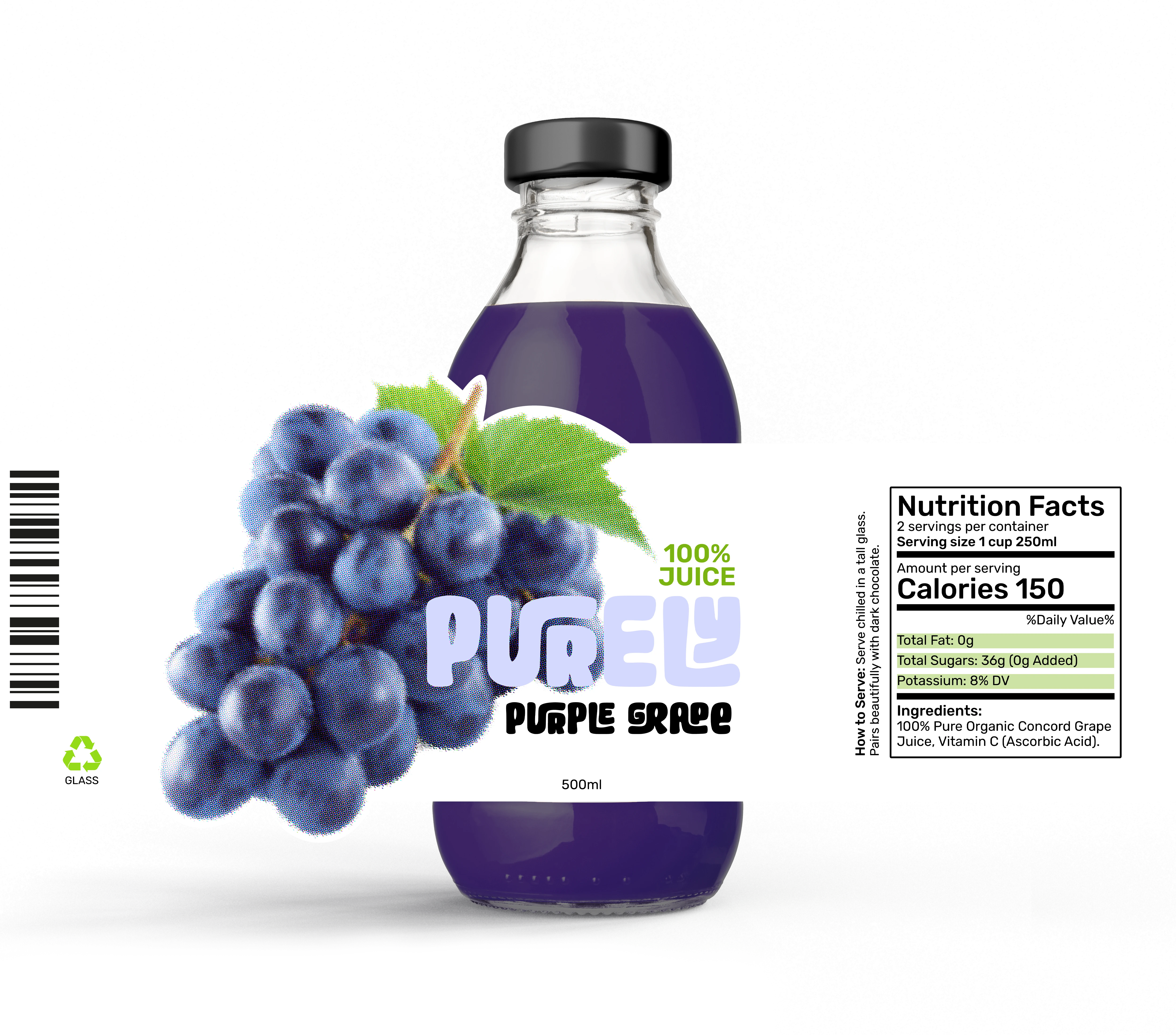
PURPLE Grape
✦The final touch. A softer but equally dynamic approach for the most refreshing flavor of the line-up. It proves the brand system works even when you tone down the darkness.